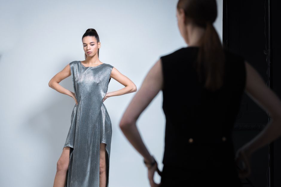
Of all the styling techniques available, monochrome dressing is perhaps the most paradoxical. It is simultaneously the easiest approach — requiring no color-matching skills — and the most demanding, exposing every error in proportion, fabric, and fit. When executed well, a single-color outfit projects a level of intentionality that multicolor ensembles rarely achieve. When done poorly, it looks like a costume. The difference lies in understanding that monochrome is not about matching identical shades but about orchestrating a spectrum of tones within one color family. This guide breaks down the principles that elevate monochrome from a shortcut to a signature.
Why Monochrome Works
The visual power of monochrome dressing comes from the uninterrupted line it creates. When the entire outfit shares a color family, the eye does not stop at color boundaries between garments. This produces a continuous vertical flow that elongates the silhouette and creates an impression of height and leanness. The effect is not subtle — it is immediately readable as deliberate and polished. But the very quality that makes monochrome powerful also makes it unforgiving. Without color to distract, every other element — cut, drape, texture, and proportion — comes under closer scrutiny.
The Psychology of Single-Color Dressing
Monochrome communicates control. It suggests that the wearer has made a definitive choice and committed to it fully. This is why monochrome looks are so common in creative industries and among style-conscious individuals: the approach signals confidence without ostentation. A head-to-toe neutral palette reads as understated authority, while a bold monochrome — all red, all cobalt, all emerald — makes a statement that is assertive without being loud. The technique allows for expression through restraint, which is a particular kind of sophistication.
Why Most Monochrome Attempts Fail
The most common mistake is treating monochrome as exact color matching. When every piece is the identical shade, the result is flat and lifeless. The eye needs variation to read depth, and without it, even an expensive outfit looks like a uniform. The second most common error is ignoring texture. In a multicolor outfit, color provides visual interest. In a monochrome outfit, that responsibility falls entirely to texture and tone variation. When all pieces are the same fabric as well as the same color, the result is monotonous rather than monochromatic.
Choosing Your Color
The color you select for a monochrome look should flatter your complexion and suit the context. Not every color works head to toe for every person or every occasion. The goal is to choose a color that you can build an entire outfit around without it feeling forced.
Neutrals: The Accessible Entry Point
If you are new to monochrome dressing, begin with a neutral palette. All-black is the most familiar and the most forgiving, but it can read as severe or expected. All-navy offers similar sophistication with a softer impression. All-camel and all-grey are quieter alternatives that feel modern and warm. All-ivory or all-cream is the most luminous neutral option, projecting a kind of ease that darker neutrals cannot match. Neutral monochrome works in nearly every context, from professional to social, and is the easiest palette to build because most wardrobes already contain multiple neutral pieces.
Color: The Bolder Statement
Monochrome in a non-neutral color is more striking and more challenging. The most successful color monochromes use a hue that flatters the wearer's skin tone — warm tones for warm complexions, cool tones for cool ones. Earth tones — terracotta, olive, mustard — are approachable because they echo nature and feel grounded. Jewel tones — burgundy, sapphire, emerald — are more dramatic and read as occasion-appropriate. When attempting color monochrome for the first time, choose a hue you already wear frequently and feel confident in. The familiarity will make the head-to-toe commitment feel less daunting.
The Art of Tone Variation
The secret to a monochrome outfit that looks styled rather than uniform is tone variation. Rather than matching identical shades, work with a gradient within your chosen color family. In an all-beige outfit, combine a warm camel knit with a cooler sand trouser and a cream coat. The subtle differences in tone create depth and dimension that a perfectly matched set cannot achieve. This approach also makes monochrome more practical, as it allows you to combine pieces from different brands and sources without requiring exact color coordination. Aim for pieces that clearly belong to the same family but are distinguishable from one another. When tones are too close but not identical, the result looks like a failed match; when they are deliberately varied, it reads as intentional.
Texture: The Monochrome Essential
If tone variation provides depth, texture provides interest. In a monochrome outfit, texture is the element that keeps the eye engaged. Pair a smooth silk top with a textured wool trouser. Layer a chunky knit over a fine-gauge skirt. Combine a matte fabric with a subtle sheen in the same color family. The contrast in surface quality creates the visual interest that color would normally provide. Without textural variation, even the most beautifully toned monochrome falls flat. The most successful monochrome outfits typically combine at least three distinct textures within the same color story, ensuring that each piece reads as individual while contributing to the unified whole.
Monochrome dressing, at its best, is a study in discipline and nuance. It asks you to remove the easiest tool — color contrast — and replace it with something harder: the careful orchestration of tone, texture, and proportion. When you master these elements, you gain access to a styling approach that is both effortless to assemble and impossible to ignore. The monochrome outfit does not shout. It simply does not need to.